
A visual identity has to work, not just look good
Creative direction, art direction and graphic design are different things. How they help make a brand coherent.
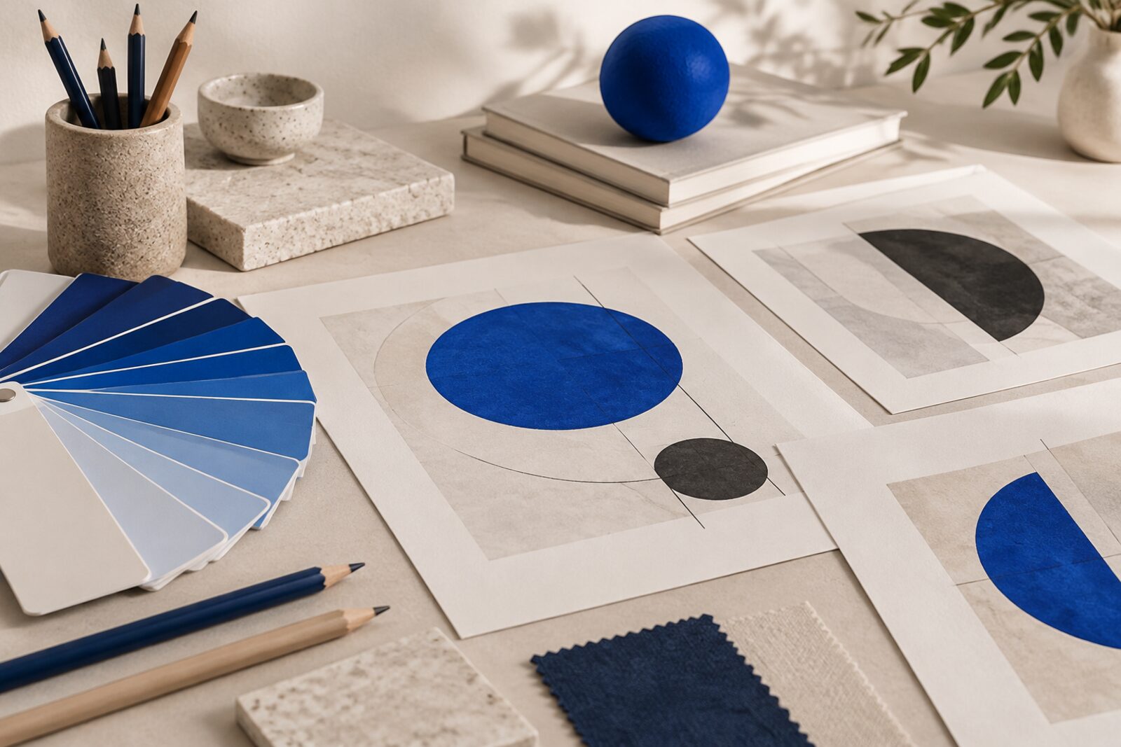
A visual identity is not a set of nice pieces. It is a system that makes the brand recognisable, relevant and coherent across all its touchpoints. Different roles are involved that are often confused, and it helps to know what each one does.
Creative direction: the concept
It defines the idea that holds the project together and sets the aesthetic and narrative direction. It is what makes a logo and a campaign seem to talk about the same thing. Without that idea, design decisions stay loose.
Art direction: the style
It turns the concept into image: photography, colour, composition, movement. The result should be recognisable at first sight and stay that way when other people use it.
Graphic design: the pieces
Logos, graphic systems, editorial projects, packaging, signage and communication materials. Good design organises information, conveys positioning and builds brand memory. If it is only pretty, it is forgotten.
What a working system should include
A checklist to review your identity:
- Typefaces and colours with clear usage rules, also for people who are not designers.
- A defined image style: type of photography, illustration and composition.
- Logo versions for each context (light background, dark background, small size).
- Real application examples, not just the logo on its own.
Web and illustration
Web design should start from strategy and content, not only aesthetics. Illustration, when used, gives the brand its own personality and is hard to copy. Both should feel like the same brand.
A quick test
If you cover the logo, is the brand still recognisable? If the answer is no, what is missing is a system more than an emblem.
At Hommu we work on brand, digital and technology from the same table. If you want to talk about it, write to us.