
Brand identity guidelines: what to include so they get used
A brand manual is not a document to file away. It is a tool so that anyone who touches the brand uses it in the same way.
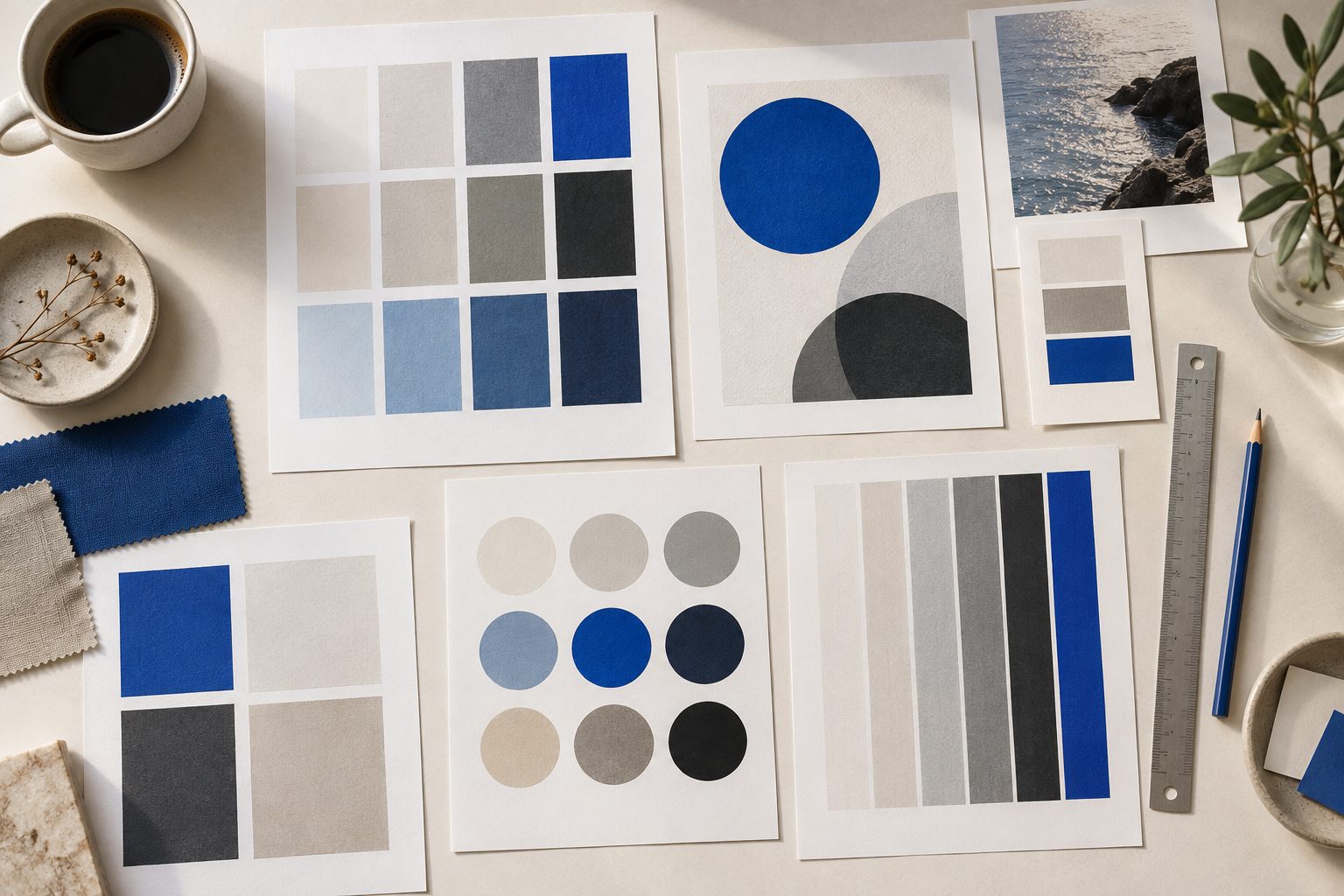
A brand stakes its consistency on small gestures: a post, a sales proposal, an event poster. If every piece starts from an improvised decision, the image ends up diluted no matter how well designed the logo is.
Identity guidelines collect decisions already made so they do not have to be reinvented. They must be clear enough for someone who was not part of the design process to use them.
The logo and its basic rules
The manual should show the logo versions: primary, secondary and monochrome, with a sentence on when to use each. What cannot be missing is the clear space around the mark and the minimum reproduction size.
A page of incorrect uses also helps: stretching, rotating, recoloring or placing the logo on backgrounds that make it illegible. Seeing what not to do saves many corrections.
Color and typography, with exact values
Saying «corporate blue» is not enough. The manual must give the exact values of each color in the formats the team uses, on screen and in print, and explain the role of each tone in the palette.
The same goes for typography: the primary family, a size hierarchy for headings and body text, and a system fallback for when the corporate font is unavailable in a document or tool.
Tone of voice and image style
Identity is not only what you see. A few lines on tone of voice, how the brand speaks and what it avoids, and on the photographic or illustration style, make pieces made by different hands feel like they come from the same place.
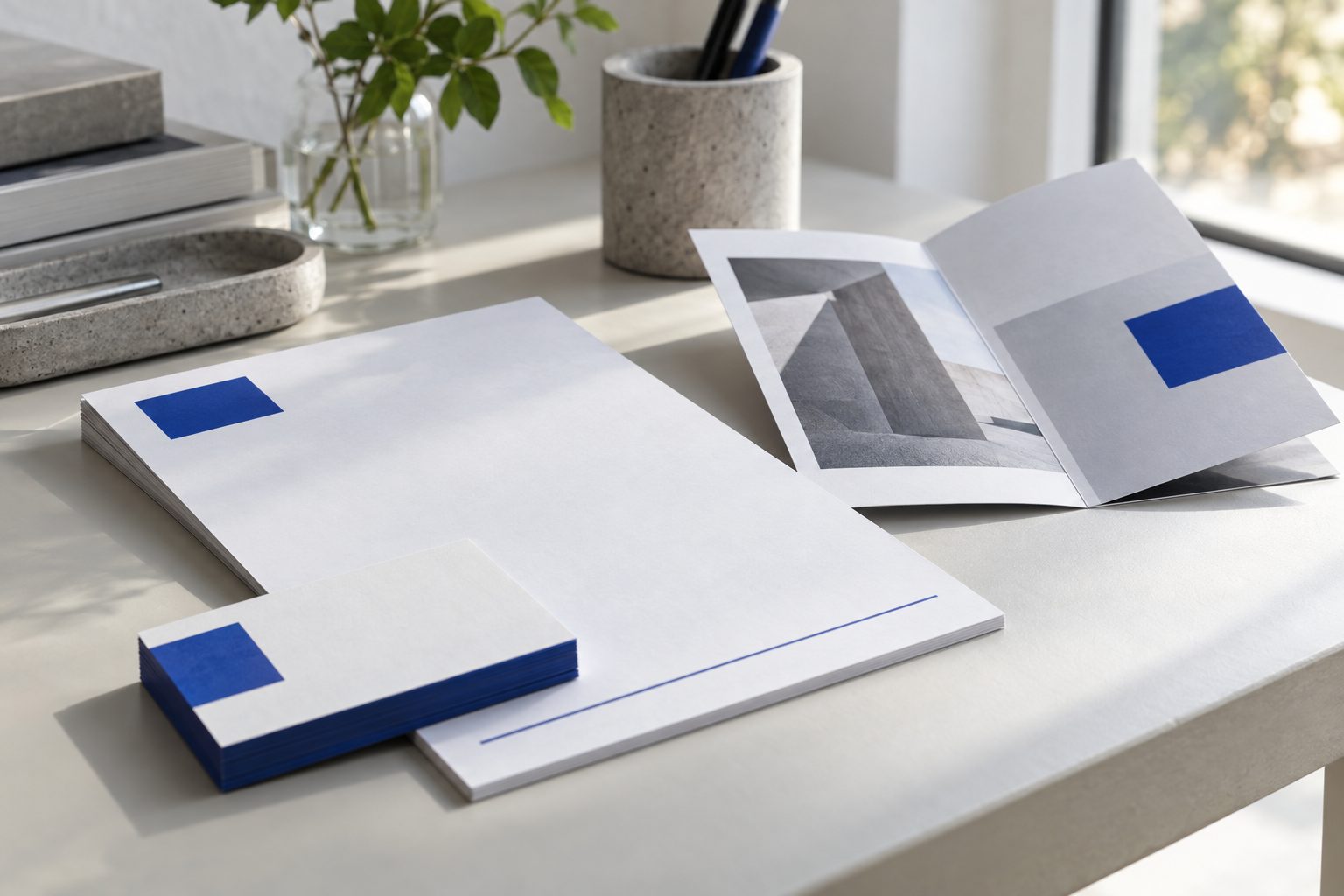
Applied examples are the most consulted part: how it all comes together in a social post, a presentation or a sales document. A few well-resolved examples beat many generic ones.
A living, accessible, versioned document
The manual must be available where the team works, not on one person's hard drive. Every new decision that settles, an icon, a template or a new format, should end up in it.
Review it when the brand grows or when new channels appear. A short manual that gets updated is more useful than a thick one nobody opens.
At Hommu, building brand manuals and identity systems is part of our graphic design, branding and creativity service. The aim is a brand that can be applied without relying on memory or on a single person.